Trends in Dental Office Design
By Geri True, A.S.I.D., A.D.M.C.
LEARNING OBJECTIVES
• Understand how the current economic climate affects design decisions in the dental office
• Better grasp how advances in technology, global information sharing, and the online marketplace influence dental office design
• Increase awareness of demographic shifts in the US population, and how to address these shifts through the design of the dental environment
• Learn about the importance of creating the practice “brand,” and how to reinforce it through the design of the office
• Recognize common pitfalls in dental office design with regard to short-term versus long-term choices
When examining the concept of “design trends” in the dental environment, it is important to consider some global realities which have a significant impact on the design choices of today:
• The “New Economy”
• The information age/global access to information and products
• Shifting demographics
• Emphasis on creating a brand
Design in the “New Economy”
The global recession has had an enormous effect on the world in countless ways, including the design of dental environments. Although low interest rates and competitive construction costs have made building new (or remodeling and/or expanding existing) offices more affordable, there is increased scrutiny of the value of the investment made. There is also a heightened sensitivity on the part of the dental patient as to the line between an office which is professional in its appearance and one which is “over the top” in its presentation.
The nature of the “New Economy” underscores the idea that one of the strongest “trends” in dental office design is to generally avoid that which is perceived as “trendy” and may soon become dated. Ultimately, the goal of most dental office projects is to create an environment which is perceived as pleasant, inviting and professional. In addition to that goal, it is economically ideal that the scheme be timeless, not rooted in a particular trend or time frame. While retail or hospitality businesses, such as Starbucks, may opt for a cutting-edge approach to their architecture and interior design, remember that they also spend a great deal on continuous renovation programs to stay on the design forefront. This relieves them of the need to make long-term choices in colors and materials, given the expectation that they will be replaced in a matter of a few years.
Contrast this approach with the design of a dental office. To make short-term choices is to invite repeated expense and disruption to the practice.
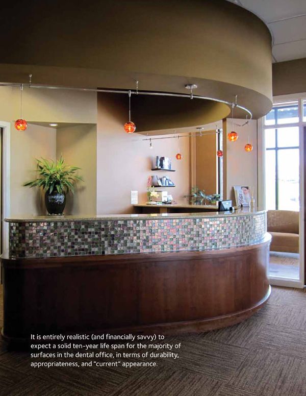
Trendy designs and color and material selections are the surest way to make an office appear dated and obsolete before its time. It is entirely realistic (and financially savvy) to expect a solid ten-year life span for the majority of surfaces in the dental office, in terms of durability, appropriateness, and “current” appearance.
Trendy designs and color and material selections are the surest way to make an office appear dated and obsolete before its time.
FIGURE 7.1
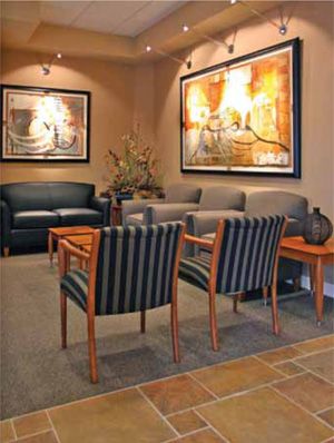
It is economically ideal that the scheme be timeles, not rooted in a particular trend or time frame, as with the reception area of Dr. Andrew Glenn in Lincoln, Nebraska.
FIGURE 7.2
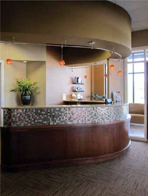
One of the best ways to maximize the value of an office design is to begin with a color scheme which is both timeless and versatile, as in the office of Dr. Amber Allen, located in Omaha, Nebraska.
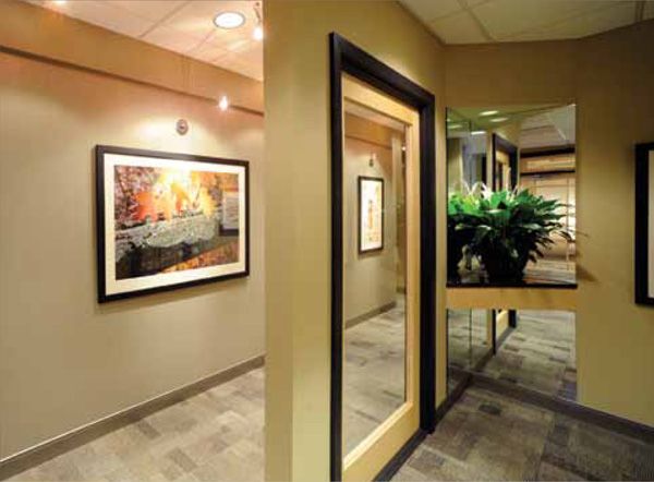
Strong colors can be introduced easily through artwork and accessories, without a daunting financial commitment, as in the office of Dr. Dominik Dubravek, in Frankfort, Illinois.
FIGURE 7.4
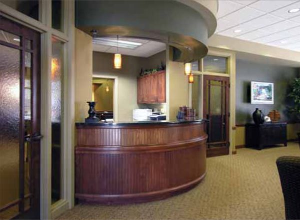
The affordability of flat-screen TVs has made them highly popular in reception areas, including that of Dr. Monte Zysset in Lincoln, Nebraska.
One of the best ways to maximize the value of that ten-year period is to begin with a color scheme which is both timeless and versatile. Versatility is a result of using a mix of colors and neutrals rather than relying heavily on a single hue. By skillfully blending warm and cool tones with variations of value and intensity, your interior designer can set the stage for seasonal décor and low-cost “refresher” updates over the life of the scheme.
It is also wise to use fairly neutral tones on surfaces which are difficult or expensive to change, and reserve bolder colors for elements which are less costly and easier to update. Reupholstering the seats and backs of reception area chairs will cost far less that recovering a sofa or loveseat; changing the wallcovering in a limited area is more cost-effective than replacing it throughout a reception area or in hallways. Particular attention should be paid to the colors and patterns used on cabinetry and countertops. While countertops can be replaced with relative ease, the process entails disconnecting and reconnecting faucets, sinks and sensors. Plastic laminate cabinetry is even more permanent, usually costing less to replace altogether than to resurface. When using strong color in a scheme, paint and accessories are generally the most budget-friendly tools available, allowing currently popular colors to be used without a daunting financial commitment.
FIGURE 7.5
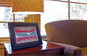
Digital picture frames can provide a cost-effective means of displaying product information or patient “before and after” photos, as shown at Owen Dental Care, Chadron, Nebraska.
No discussion of color scheme is truly meaningful until it includes the actual finish materials selected for your project. Just as optimal color choices will extend the aesthetic life of the scheme, appropriate finish material selections will impact the usable life and ongoing cost of maintenance for the office. The concept of total cost of a product over its use is called its life cycle cost.
Life cycle cost includes far more than the initial cost of a product and its installation. It includes all maintenance and repairs it requires (which can vary widely between products), and the cost of removal, disposal, and re-preparing the substrate to receive its replacement. Repair or removal may also entail the cost of removing and reinstalling equipment, furniture, and/or artwork. All of these costs must be added together and divided by the years of product use in order to determine its actual cost per year. A comparison of such variables between finish materials allows sound, long-term, financially-wise decisions to be made.
The Information Age
We are living in era which allows unprecedented freedom for personal expression through design. The availability of innovative products and sharing of design ideas through TV shows, online sources and social media has greatly raised the public’s design awareness. It could also be argued that this abundance of information must be tempered with some much-needed critical thinking.
The internet can be an extremely helpful tool in finding inspiration, whether it means looking at other dentists’ website “office tours,” perusing dental design companies’ online galleries, or searching for specific products. Creating virtual photo files and “pinboards” of ideas can assist you in determining your likes and dislikes, and in communicating your desires to the design professionals assisting you with your project. However, it is wise to look beyond what is simply visually appealing in cyberspace.
It is all too easy to make the assumption that a product or idea from HGTV or Pinterest would automatically translate to the dental environment. Wallcoverings which might be attractive in a residence may not meet applicable fire codes for a dental office. Concrete floors which appear hip and trendy in a restaurant atmosphere may wreak havoc on dropped instruments and sensors. Chairs purchased from a residential furniture source may be uncomfortable in a dental office reception area, or fail to hold the weight of a large patient.
Every design decision must be viewed through the lens of what is appropriate for the requirements of the dental environment. Often overlooked considerations include:
• The need for high-quality commercial grade furnishings which will accommodate patients of all ages and sizes
• Flooring materials which will absorb sound, cushion dropped instruments, and which are slip-resistant and easily maintained
• Wall finishes, upholstery materials, and window treatments which are durable and flame-retardant
• Countertop materials which are stain-resistant and cost-effective
• Ceiling systems which provide acoustical benefit and allow access to electrical and mechanical systems
• Spatial arrangements and full-height walls which provide visual and acoustical privacy for patients and staff
The digital age has provided not only a source of design inspiration and dental technology, but has also impacted design throughout the dental office. The affordability of flat-screen TVs has made them highly popular not only in reception areas, but also in children’s play areas and special “theater” spaces. Viewing monitors are ubiquitous in treatment rooms for patient education and distraction, and in consultation rooms for case presentations. Reception area monitors may also be used in a more practice-focused manner, by incorporating vendor-provided programming or customized marketing videos.
Video alternatives to artwork, fireplaces, aquariums, and other office standbys (such as bulletin boards) are being used with increasing frequency and creativity. Digita/>
Stay updated, free dental videos. Join our Telegram channel

VIDEdental - Online dental courses


