Chapter 17
The Dental Office
When the pediatric dentistry (pedodontic) treatment triangle was first described, one corner of that triangle featured the “dentist, dental staff, and the office environment.” Despite the recognition of its importance, little has been written about the office environment in the pediatric dental literature, yet young pediatric dentists, graduate students, and residents spend countless hours thinking about their future dental offices, dwelling on what should and what should not go into their offices.
One of the first to recognize the importance of the office environment was Dr. Walter Doyle, who teamed up with the architect Sarah Tait to co-author one of the first publications featuring office design in a pediatric dental text. They wrote that designing an office was analogous to planning a city. Two of the innovations that they stressed were an office that would be open and flowing, with few doors and a multi-chair open operatory concept. Tait and Doyle (1975) wrote the following to encourage dentists to think about their office.
What is dental environment?……………… A place that allows teeth to grow and change in a healthy way.
What is dental environment?……………… A place that allows the child to grow and change in a healthy way.
What is dental environment?……………… A place that allows the doctor’s staff to grow and change in a healthy way individually and collectively.
What is dental environment?………………. A place capable of its own growth and change with respect to the life it sustains and maintains.
Since the “special effects” created within pediatric dental offices can be critical to some patients’ attitudes, the office environment can be an important part of behavior management. But it is only the starting point. Behavior management also involves numerous techniques and strategies. It requires skills in communication, empathy, coaching, and listening. Having an office that accommodates these management techniques and strategies is part of the “art” of behavior management. There are many types of pediatric dental offices. Some could be considered basic, while others might be called “glitzy.” Some offices are designed for more than one dentist; some might be designed for numerous dentists, hygienists, or expanded-duty dental assistants. The point of this chapter is to identify features that are unique to pediatric dental offices.
Pediatric dental offices are unique. That is why many hours are spent thinking about the office. Be cautious when selecting an office designer or consultant. A traditional dental supply company may suggest a design based upon a standard template. Relatively few office designers appreciate or understand the needs of a pediatric dentist. When designing an office, several important questions need to be asked.
- Does the image that your office projects promote cooperative patient behavior and patient-parent acceptance?
- Is the space provided sufficient for the optimal function of the practice?
- Does the office make it possible to use management techniques appropriately?
- Does the office permit you to practice in the style that most suits you?
Office designers may not focus on these issues. To attract young dentists, the focus is often a financial one. Sales pitches are often along the lines of “We design high-performance offices,” or “Let us increase your productivity through a good design.” No one denies the importance of earning a good living. However, treating patients properly, using appropriate management techniques with care and understanding, should lead to that outcome.
Patients differ. Dentists differ. And, offices differ.
Reception, Waiting, and Play Areas.
The reception, waiting, and play areas are interconnected, and each requires a great deal of planning. They are critical to the office operation—they are like a store front window. They set the tone for the office and create expectations for both the children and their parents.
Patients should see the receptionist counter as soon as they enter so they don’t feel lost. In turn, the receptionist should be able to see all patients, no matter where they are seated, so nobody is forgotten. All pathways should be wide enough, and the receptionist’s counter low enough, for children in wheelchairs. When determining how big the waiting room should be, one should take into account that pediatric patients tend to visit the dentist as families. Often one patient will be accompanied by parents, siblings, and sometimes even friends. For example, a general practice office waiting room size calculation would be:
Accordingly, a solo practice with three exam rooms that peaks at six patients per hour should plan on a 240-square-foot (22 m2) waiting room with twelve chairs. A pediatric dental office would need even more space.
When considering play areas, do not begin with the numbers game. Play can happen intensely in 1 square foot or in 1000 square feet. Maybe the first question to ask is, “What will the play experience mean within the framework of the child’s experience in this dental office?” Is play a diversion from the dental experience, or a simulation? Is it an introduction to the dental experience? What are the limitations of the play experience? Is the noise undesirable? Should the play be segregated from other areas? Is play a potential resource for the pediatric dental office that is vitally concerned with preventive and interceptive dentistry? Are parents involved in the play area? Is the atmosphere of the waiting room one of calmness, or perhaps excitement? Should the child waiting for an appointment be stimulated by a video game—perhaps magnifying hyperactivity—or should their time in the waiting room be relaxing and calming? The play area is a potential resource, for not only play, but for learning and behavior management. Make the most of it.
Excellent products are exhibited at dental meetings for waiting and/or play areas. How will they fit in the dental office? Will they cater to older children and teens, or will they be used by younger children or preschoolers? When thinking about the play area, several considerations are:
- The space has to be developmentally appropriate.
- The safety factor is a prime consideration.
- All toys or products should be hygienic.
- Equipment should be tough and long-lasting.
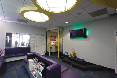
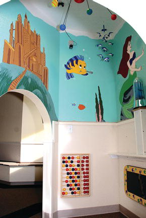
With these thoughts in mind, consider Figure 17-1. This waiting room area was designed with many of the elements mentioned above, and includes a reading section, a toddler/young child play area, and a teenager video game corner. Figure 17-2 is another example of a waiting area that accommodates both children and their parents. The play area is designed for younger children and preschoolers, and is separated from the general sitting area. A novel approach to waiting room play areas is a “cave” for children. Toys, games, and magic mirrors all can be contained within the cave (Figure 17-3). The area within the cave may be room-sized or significantly smaller. Its function is to allow a division between the play area and the general waiting area. In addition, it gives the children a sense of privacy and fun. The cave concept can also be used in smaller offices with limited space; prefabricated play houses are commercially available and serve the same purpose.
Figure 17-1. This waiting room area design has many elements mentioned in the text, including a reading section, a toddler/young child play area, and a teenager video game corner, which is isolated by glass.
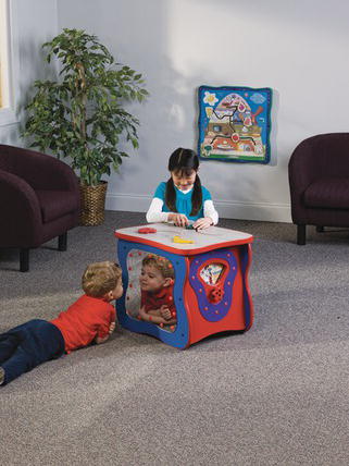
Offices shared by multi-disciplinary dentists may have mobile play stations that can be displayed during the pediatric dentist’s office hours and removed at other times so as not to label the waiting room as exclusively pediatric in nature. The module shown in Figure 17-4 is designed for small children and can be set anywhere, allowing parents to supervise. Note that it appears hygienic, safe, and tough and long-lasting.
Figure 17-2. A waiting area that accommodates both children and their parents. The play area is designed for younger children and preschoolers and is separated from the general seating area. Courtesy of Drs. Walker, Ritchie, Kutsch, Gill. Richland, WA.
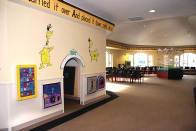
Figure 17-3. Inside view of “cave” area depicted in Figure 17.2. Toys, games, and magic mirrors all can be contained within the cave. The cave area gives the children a sense of privacy and fun. Courtesy of Drs. Walker, Ritchie, Kutsch, Gill. Richland, WA.
In general, noisy games should be discouraged or used only in separate rooms. Sounds of children playing may not only be a nuisance to other patients in the waiting room, but also may disrupt and interfere with the receptionist and front desk. It is also advisable for an office employee to be able to see the play area, since many parents may allow their children to play unsupervised.
Games may be divided into non electronic/electronic, younger/older children-oriented, physically interactive, or passive. Electronic games may be touchscreen or include handheld joy sticks or steering wheels. They may be enclosed in protective casings to prolong their working life. Touchscreens have the advantage of being more user-friendly and less likely to break.
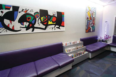
To encourage child-parent interaction, a reading corner may be constructed (Figure 17-5). The use of display shelves similar to book store displays is suggested to make the books more desirable (Figure 17-6). Among the books are ones with dental themes and children’s classics familiar to both parents and children (inset). Book set collections are available from vendors, making them easy to purchase.
Another parent-child activity may be a desk station to be used for homework. Siblings may get their homework done while waiting for the other family members’ treatments. The same desk may be used by parents as an office in the morning while their child is undergoing a sedation visit. Parents may set up their laptops and phones while waiting. Lastly, a simple drawing corner with old-fashioned crayons and markers can be set up easily. Patients may be encouraged to present their drawing to the dentist and have it proudly displayed on a designated bulletin board.
Figure 17-4. Offices shared by multi-disciplinary dentists may have mobile play stations that can be displayed during the pediatric dentist’s office hours and removed at other times so as not to label the waiting room as exclusively pediatric. Courtesy of Playscapes. Waunakee, WI.
The waiting room area may also be used for practice management. An informational video may be played constantly played for parents and children. The film may present office policies and services. A computer kiosk can be used to fill out medical history and other forms electronically, which are then submitted directly into the computer network. It goes without saying that WiFi internet access should be available in this area for the use and benefit of parents and patients.
Figure 17-5. To encourage child-parent interaction, a reading corner may be constructed. The use of bright modern art may be pleasing to both adults and children. It can make the room more energetic.
Office Themes
Many modern offices use themes, setting up the waiting room, play room, and treatment rooms like amusement parks. Many themes, like the jungle, space, or medieval castles, appeal to children of different ages. Using a theme often makes it easier to decorate, since the design has a clear direction. However, a theme can become outdated relatively fast. Some people choose to have a multigenerational and timeless theme, which provides an environment for all age groups, including parents.
Hallway Designs
Belcher (1898) was the first to write that children should be separated from their parents for the first visit. Parents were told that it was against “office policy” for them to accompany their children into the operatory. Until about 1980, this became an inviolate rule for many. Although the no-parent policy generally has changed (as discussed in Chapter Four), it still continues in some practices. Nonetheless, contemporary practice surveys have shown the trend is for parents to accompany children into the operatory, especially during the first visit. Now, more than ever, they form a greater part of the pediatric dentistry treatment triangle.
Dental offices have to be designed to accommodate current trends. Typical of the open office design is the “Z” shaped hallway connecting the reception/waiting area with the treatment areas (Figures 17-7 and 17.8). Interestingly, dentists with this type of hallway design notice that children tend to wander into the clinical area by themselves–no coaxing necessary. Parents, too, seem more relaxed and tend to remain in the reception area after one or two visits. They take comfort knowing that their children are not behind closed doors and can often hear their children interacting with the dental team. A writing board may be strategically placed on a wall within the Z hallway. Children are attracted to the writing board. They play, write, or draw (teeth!) before their dental appointment, and sometimes leave messages of thanks to the dental team as they leave the office. In some offices, a pocket door is installed along the hallway. If excessive noise results from an uncooperative child in the treatment area, the door can be drawn closed.
Figure 17-6. Using shelves similar to book store displays makes the books more desirable (a). Among the books are those with dental themes and children’s classics/>
Stay updated, free dental videos. Join our Telegram channel

VIDEdental - Online dental courses


