Practice Note
Ergonomics is the study of the effects of the work environment on health and well-being.
Physical Environment
Physiologic factors include color, lighting, acoustics, heating and air conditioning, space, and furniture and equipment. Color plays a major role in how a patient perceives a practice and in the staff’s health, productivity, and morale. An attractive, cheerful, and efficient office inspires confidence in the staff and comfort in the patient. A drab, dirty, or untidy office can create an attitude of doubt or mistrust. Light and dark colors can be effectively used and may vary according to geographic location. Some decorators work with dark colors for walls and then use lighter accent colors to downplay the dark base color. Designers today use a variety of color palettes to enhance an office and make it warm and comfortable for both patients and staff. Dental offices no longer need to present a stark, sterile image. A comfortable patient is a happier patient. Moreover, staff productivity is likely to be greater in a pleasant working environment. Many office plans are available; the one chosen should reflect the dentist’s personality and satisfy the needs of both staff and patients.
Office Design and the Americans with Disabilities Act
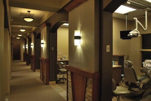
For years, patients have had difficulty gaining access to dental treatment rooms as a result of poorly designed offices. The Americans with Disabilities Act of 1990 has influenced the design of dental offices with regard to patient treatment. Special attention should be directed to this act to ensure that the office design complies with state and federal guidelines. The Justice Department issues accessibility specifications for offices, but some states have even stricter standards. Accessibility features must be incorporated into building renovations, and those features must be accessible from elsewhere in the building. For example, making a lobby bathroom accessible to a wheelchair patient is not adequate if the patient cannot get to the lobby. Wider hallways enable a patient in a wheelchair to easily access treatment rooms and other areas of the office (Figure 6-1). Box 6-1 presents a list of recommendations for designing a barrier-free office.
The government estimates that the cost of incorporating accessibility features into new construction is less than 1% of construction costs. Because remodeling existing buildings usually is more costly, the requirements for them are less stringent. Currently the law requires only “reasonable modifications” that are “readily achievable,” but both terms may lead to litigation. Further information about the Americans with Disabilities Act is available from the sources listed in Box 6-2, or it can be found online at www.ada.gov or www.access-board.gov.
Seasonal Affective Disorder
In geographic locations in which there are extremes of sunshine and darkness, patients or staff may be affected by seasonal affective disorder (SAD). Sunlight serves to keep the body’s internal circadian clock in sync, so a person is alert and awake during the day and ready to sleep at night. A person’s health, mood, and behavior can be affected when the quality and quantity of sunlight are lessened. A direct consequence of SAD can be winter depression or sleep disorders.
Many offices provide lighting systems to help individuals overcome SAD. If staff members are affected by SAD, it may be worth the investment in such lights to increase the health of the staff. Most of the lights are designed for the brightness needed for light therapy. With a brightness level of 10,000 lux at 18 to 24 inches, these lights have been proved to provide fast and effective light therapy at a comfortable distance. Most of these lights are easy and safe to use (i.e., they contain no harmful ultraviolet rays). It is also recommended that a person with SAD have his or her treatment room or desk placed near a window. This may not be feasible in some office designs, but it may be a factor to consider with new construction.
Design of the Reception Room
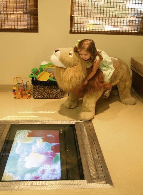
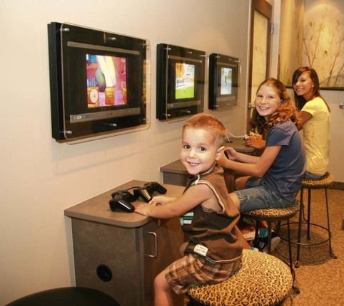
The reception room (the term waiting room has a negative connotation and so its use is being phased out) is the gateway to the dental office, and it provides the patient’s first impression of the dentist. A warm atmosphere can be created in the reception room by furnishing a comfortable “living room” environment. The office should reflect the theme that originates in the reception room (Figure 6-2).
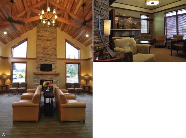
Patients should be able to check in with the administrative assistant at the desk as soon as they arrive. For privacy, patients should have access to a restroom off of the reception room, and appropriate signs should direct them to this area.
Seating in the reception room varies from office to office, depending on individual practice styles. A general rule is to provide two seats for each dental chair in a general practice. High-volume practices, such as orthodontics or pediatrics, require three or four seats per dental chair, whereas an oral surgery or endodontic practice needs only one or two seats per chair.
Seating space is an important consideration. People generally do not like to have others sitting too close to them. When completing forms or other business activities, a person needs some privacy. Comfort should be the major concern when selecting furniture for this area; it needs to be sturdy but not too formal or too casual. Low, cushiony couches and armless chairs are sometimes difficult for even an agile person to get out of and even more difficult for an older adult or an arthritic patient. Figure 6-2, B, illustrates comfortable armchairs with sturdy bases.
Special amenities are a thoughtful gesture, such as a desk-height table with an electrical outlet that makes it convenient for businesspeople or students to bring laptop computers to use while waiting. A self-serve coffee or juice bar is a considerate gesture toward busy patients. These amenities send a message that the dentist respects patients’ time and wants to make the office a friendly place to visit (Box 6-3).
Business Office Work Triangle
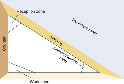
The design of the business office can be likened to the design of a kitchen in one’s home. A kitchen design starts with the “work triangle,” which keeps the three primary work centers or zones in close proximity, thereby eliminating wasted effort and time. The triangle in a kitchen is measured from the center of the sink to the center of the refrigerator to the center of the cooktop. Likewise, the design of a business office can take into consideration three main zones: the reception zone, the intraoffice communication center, and the work area zone. A good rule of thumb would be to measure the distance from the center of the reception zone to the center of the communications zone and to the center of the work zone to ensure that the perimeter of the triangle does not exceed 26 feet. This distance should be uninterrupted by traffic or cabinetry. Limiting the distances between these three zones allows the business office staff to be efficient while reducing the stress associated with walking long distances.
The zones, which may also be known as work centers, complement the work triangle. By planning zones within the triangle, one can ensure that different tasks can be carried out without collisions. In the reception zone of the triangle, there should be adequate space to meet and greet patients and make appointments. In the intraoffice communication zone, the administrative assistant should be able to manage the telephone; to access a computer for appointments, clinical data, financial records, or other information; and to communicate with the clinical areas. The work zone maintains space for preparing, filing, or copying records; using the fax machine; or performing other activities that require counter space or file access. Figure 6-3 illustrates an example of a work triangle.
Stay updated, free dental videos. Join our Telegram channel

VIDEdental - Online dental courses


 Practice Note
 Practice Note
