Fig. 8.1
Brainstorming regarding possible cause for increased medication errors
Fishbone/ Ishikawa Diagram
Fishbone , or a “cause and effect” diagram, is a graphical representation of a given situation. The process involves a systematic analysis resulting in identification of all possible causes. The fishbone begins with a skeletal diagram demonstrating the direction of the process, where the end result or “effect” is represented with a word with a box drawn around it and an arrow pointing towards it. Possible causes are identified and categorized (such as people, material, methods, environment, etc.), and the group then brainstorms situation-specific causes under each category (Fig. 8.2). Categories may vary depending on the circumstances [32].
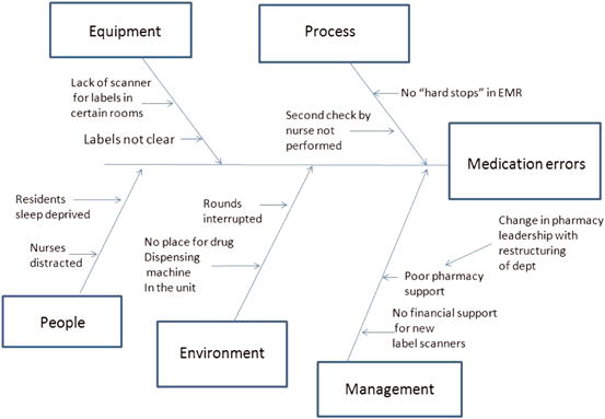
Fig. 8.2
Fishbone Diagram showing potential cause for medication errors
Pareto Chart
The pareto chart is based on the ‘80/20 principle,’ which stems from a belief that 80 % of solutions are found in 20 % of causes. A pareto chart combines bar and line graphs, where the bars represent occurrence of each cause and the line graph represents occurrence of cumulative totals. This method helps isolate common causes that lead to a particular event and draws the attention of the group to the “vital few” rather than the “trivial many” causes leading to an event. Solutions can then be formulated to specifically target these important causes, leading to better utilization of resources and reduction in waste—a key component of quality improvement [33, 34].
Performance Matrix
This method involves a process of categorization of potential causes into one of four categories which are represented by a graph where the X-axis represents the frequency of events and the Y-axis represents the seriousness of the event. Causes are categorized into one of four categories and then plotted on this graph . Unimportant (rarely root causes), serious but seldom (often root causes due to impact of a single event), frequent but harmless (may not be a significant root cause based on single impact, but gains impact due to frequency of occurrence), high frequency high seriousness (most important group for RCA due to high impact and frequency of occurrence).This method allows investigators to identify areas with maximum impact [35].
Scatter
A scatter plot is a mathematical diagram where two variables in a given set of data are depicted using Cartesian coordinates. In these graph, the cause is plotted on the X-axis, whereas the effect is plotted on the Y-axis. As an example, to analyze compliance with a central line maintenance bundle, the use of the bundle/patient may be plotted on the X-axis and CLABSI events/patient on the Y-axis. If lower compliance with the central line bundle were to coincide with greater number of events, it would cause and effect (Fig. 8.3).
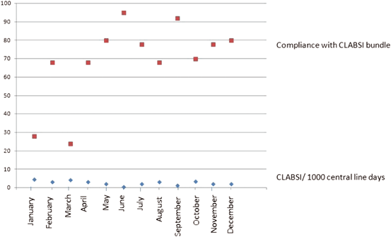
Fig. 8.3
Scatter diagram showing compliance with central line-associated blood stream infection (CLABSI) care bundle and incidence of CLABSI
Flowchart
A flow chart is a diagram representing a sequence of occurrences leading up to a final event. This method allows the team to identify contributing factors, whether direct or indirect [29].
Shewhart/Control Charts
A control chart is a graphical representation of an event in comparison to the upper and lower limits of acceptable norms, which are represented by continuous lines) .In this format, the occurrence of events within the range between the upper and lower control limits may be considered acceptable. This format is best used to monitor compliance with a prescribed behavior, for example, the use of a maintenance bundle for central catheters to reduce CLABSIs in an intensive-care setting [8, 9].
Histogram
A histogram is a bar graph representation of data. In the RCA process, histograms are often more useful than tables because these provide a visual, easy-to-understand tool to understand the frequency of various occurrences. This format may allow the investigator to identify major causes and the solutions that most likely to be effective. Interestingly, the patterns on a histogram may also demonstrate different issues. For example, a comb-like distribution demonstrates too many categories without enough numbers in each, indicating that there may be a common underlying cause behind multiple sub-categories. In contrast, a curve demonstrates a trend towards single-factor dominance, whereas a single peak indicates the presence of a single over-riding cause contributing to the occurrence of the event (Fig. 8.4) [36].
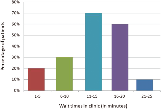
Fig. 8.4
Histogram showing percentage of patients by wait times in clinic
Run Chart
A run chart is an illustration of certain measures plotted against time with annotations of ongoing changes in a system . Such an illustration can help in identification of variations and trends in events, and if followed prospectively, could identify a cause- effect relationship between changes in the system and outcomes (Fig. 8.5) [37].
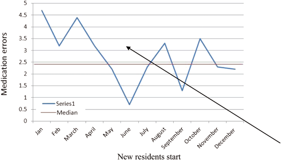
Fig. 8.5
Run chart depicting occurrence of medication errors per month
Causal Tree
A causal tree is also a diagrammatic representation of why an event occurred. In this format, the event is placed at the top of the diagram and potential causes are placed under it until all possible causes are explored. A comprehensive approach would be to ask the question “why” five times to ensure the thoroughness of investigation. Each time the question “why” is asked, it forms a new layer in the causal tree [38]. The number 5 is arbitrary, but highlights the need for extensive questioning into the process.
This method of investigations is simple and ensures exhaustive exploration of potential causes. This method also encourages analysis even in “near-miss” events, which are represented to the side of the “event”. This allows the identification of systemic strengths and helps operational leadership to identify areas that need to be protected at the time of budget cuts (Fig. 8.6) .
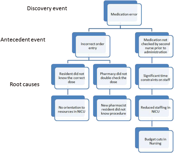
Fig. 8.6
Causal Tree demonstrating investigation of medical errors
Once the entire sequence of events has been charted out, the investigators are now well-placed to identify the “causal factors”. Although the group is usually focused on the most obvious and the single most-important factor at this stage, there is a need to exercise caution about not missing other contributors .
Step 5: Identification of the Root Cause
Once all the causal factors have been identified, the investigators then begin the process of RCA using the root cause map. This map structures the reasoning process and helps highlight the major causes. This is a key step in the process, since a limited approach at this stage could result in pursuit of the wrong cause behind a sentinel event.
Step 6: Recommendations and Implementation of Change
The goal of the RCA is to identify system-based problems and make recommendations regarding solutions that will prevent a sentinel event from occurring again [19].Often, the leaders involved in RCA are not the operational leaders, and therefore, are not directly responsible for implementing the changes. At this stage, the involvement of the operational leadership is critical to ensure efficiency in the process.
Where to Aim Recommendations
The findings from an RCA should be brought to the attention of the highest level of management involved in the process. There should also be a forum for periodic and ongoing review of the sentinel events and the implementation of changes where such issues can be discussed periodically. Finally, for the RCA process to accomplish its logical goals , all stakeholders need to be in consensus about the risk posed by the sentinel event(s), the quality of evidence , and the strength of the recommendations.
Step 7: Presentation of Results
Root-cause summary tables are perhaps the most comprehensive way to report findings from a root cause analysis . These tables are typically comprised of three columns: the first column represents a description of the causal factor with adequate background information to allow an uninitiated reader to understand the significance of the causal factor. The second column represents the piece of the root-cause map involved in the causal factor, and the third column presents recommendations to address that specific causal factors. This three-column method of reporting is simple, and yet ensures that all the identified causal factors are addressed. While final reporting tools depend largely on the administrative needs of each hospital, this method includes all information that is typically required in a final report and could be used as a tool by the QI group, to prepare the final report on a given sentinel event.
Step 8: “Tests of Change”
Before implementing a change, the leadership should consider one or more pilot tests to identify any unforeseen difficulties that could limit its acceptance by the end-users. If the recommendations need to be revised, there may be a need for repeat pilot testing prior to widespread implementation.
Barriers to an Effective RCA
Since methodology is critical to a high quality RCA, the process should be led by an individual with experience and training . An RCA can be flawed if undue emphasis is placed on a single finding, ignoring other possible cause. Exhaustive analysis of all possible root causes is essential for this tool to be effective. Additionally, undue emphasis should not be placed on a “single” cause for error and efforts should be made to find common factors across investigations [16, 21].
Evidence of Effectiveness of Method
Several studies show that the effectiveness of RCA is dependent on the implementers’ knowledge of the process, and that there is a need for training healthcare professionals in this technique. A study conducted in England showed that training healthcare professionals in the RCA process led to a significant increase in the number of individuals taking on leadership roles in the process and a reduction in difficulties reported during the process [39]. Studies also confirm the utility of RCAs in shifting institutional culture from individual blame to the identification of systemic errors [40]. A study in Texas demonstrated a significant reduction in in self-reported adverse drug events following the implementation of a blame-free RCA process. This led to changes in organizational leadership and the development of policies to promote patient safety. Other organizations that adopted active surveillance systems experienced an increase in error reporting in a blame-free environment, eventually leading to a reduction in the frequency of various sentinel events [18].
Despite significant evidence to support the value of RCA in institutional culture change, very few studies have rigorously measured the efficacy of this method in promoting change in practice. The authors of the Texas study reported that the RCA process resulted in improvements in medication ordering and distribution, including placement of “hard stops that reduced medical errors [18].A study from the Veterans administration hospitals showed that the recommendations from an RCA were implemented in their entirety in 61–68 % instances, and were only partially implemented in 20 %. The he outcomes from these changes were not reported [41
Stay updated, free dental videos. Join our Telegram channel
VIDEdental - Online dental courses