Fig. 6.1
Control chart. (Courtesy: Damber Shrestha, Department of Neonatal Paediatrics, KEM Hospital for Women, Perth
Clinical Value Compass
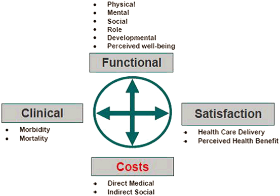
The Clinical Value Compass framework (Fig. 6.2) places patients both as individuals and as a patient population at the centre of what we measure. It has us examine not just the traditional clinical outcomes such as mortality and key morbidities that we are familiar with, but expands our measures to include those measures that matter to patients and their families in terms of functional outcome, satisfaction and costs to include assessment of the value of our service [13]. Value can be considered as a measure of quality defined by the outcomes (clinical/functional/satisfaction) measured as a function of cost for same over a defined period of time. The strength of the Clinical Value Compass is that it encourages us to look at outcomes in all directions—clinical outcomes of interest to medical/nursing professionals, functional and satisfaction outcomes that may matter more to patients and their families (especially in the medium to longer term) and to healthcare managers who will wish to measure cost in addition to the other domains to ensure value within the healthcare system .

Fig. 6.2
Clinical value compass framework
In terms of driving changes and improvement , we need to measure our outcome data to quantify how patients are doing across key clinical, functional, satisfaction and cost domains. Many of our own personal drivers towards improvement include firstly comparing our current outcomes against our previous results to see if we are getting better or worse than before—time trend analyses e.g. process control charts (Fig. 6.1) and secondly comparing our own service and patient outcomes against our peers and colleagues i.e. benchmarking our outcomes against others or indeed wider international reference standards.
In discussing measurement of processes and outcomes within healthcare, it is important to be clear about the language and definitions used, particularly given the diversity of the modern healthcare multidisciplinary team . Any system can be simply defined as being composed of multiple parts working together for a common purpose or goal. A healthcare system can then be defined as the organisation of people, institutions, and resources to deliver healthcare services to meet the health needs of target populations. Within healthcare systems, process can be defined as a series of connected steps or actions to achieve an outcome. Performance measurement is the use of both process and outcome measures to understand the healthcare systems organizational performance and effect positive change to improve care [14]. A key performance indicator (KPI) is any quantifiable measure that is tied to organizational goals , used to evaluate performance over a designated time period. It is used to determine whether the practice, hospital, or other accountable organization is meeting predefined targets [15]. Many healthcare systems use dashboards which are performance monitoring systems that provide data on structure, process, and outcome variables [16]. A dashboard within a healthcare setting typically includes:
a.
reports on a selection of performance indicators (feedback);
b.
comparison of performance to established ideal levels (benchmarking);
c.
alerts when performance is sub-optimal to trigger action (warning or signal).
Similar to the dashboard in our car, an organizational dashboard provides a visual display of how various components or systems within the organization are functioning.
Appropriate benchmarks are necessary to determine how performance compares against desired goals and objectives and against others. Benchmarking is that process through which best practice is identified and continuous quality improvement pursued through comparison and sharing [17]. However, for comparisons to be fair and valid because centres may vary with respect to their population case-mix , risk adjustment is essential to making fair comparisons. The term “case-mix” reflects the fact that, within a patient population, individual patients may have a range of risks, and that the aggregate outcome reflects the aggregate risks [18]. Risk adjustment is the process of sorting patients in each comparison group into different levels of risk and then making comparisons separately for each level. The aim of adjustment is to permit fair comparisons between groups.
“Common cause” and “special cause” variation is seen in every area of medical practice. Potential sources for variation seen in both interventions and outcomes include case-mix, chance and differences in quality or effectiveness of care. When benchmarking outcomes, if differences due to case-mix and chance can be minimised through risk adjustment , then the residual variation may provide useful information about the quality of care provided.
Benchmarking and risk adjustment requires strict definition of each specific outcome. Each risk factor is measured and weighted accordingly. Severity of illness scores attempt to measure illness severity and assist in adjusting for case mix between populations. For example, the main illness severity scores in use in neonatal medicine are CRIB [19] (Clinical Risk Index for Babies) and SNAPPE-II (Score for Neonatal Acute Physiology—Perinatal Extension II) [20]. Like illness severity scores in adult critical care medicine, both these scores rely on physiology-based items from bedside vital signs and laboratory tests to quantify illness severity. Each scores derangements from physiological norms, the greater the derangement from physiological norm, the greater the likelihood of adverse outcome with a composite severity score derived from weighted sum of derangement across all organ systems . Combining these physiology derangements with other risk factors including birth-weight, gestational age, low Apgar scores and the presence or absence of severe congenital abnormalities an illness severity score with an overall risk of mortality is generated. A recognised disadvantage of both CRIB and SNAPPE-II scores is that they rely on physiological variables measured after admission to the neonatal intensive care unit (NICU). Because these variables may be influenced by the treatments provided after admission to the NICU, the scores are not independent of the effectiveness or quality of care provided [21].
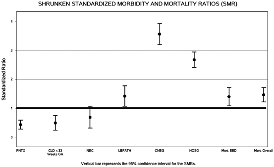
Within Perinatal-Neonatal medicine, the Vermont Oxford Network (VON) was established in 1988 as a non-profit voluntary collaboration of health care professionals dedicated to improving the quality and safety of medical care for newborn infants and their families [22]. It now comprises over 950 Neonatal Units around the world. VON facilitates benchmarking and comparison by utilising strictly defined data definitions within clearly defined patient populations within the network and case-mix risk adjustment . To adjust for risk VON uses a multivariable risk adjustment model designed to capture important factors related to patient risk [22]. The model is used to calculate an expected number of cases for each specific outcome of interest based on the case mix seen at each hospital. Measures of interest can then be created for each hospital. One such measure is the ratio of the number of observed to expected cases (O/E), called the standardized mortality or morbidity ratio (SMR-Fig. 6.3). This measure and its confidence intervals are corrected or shrunken using methods that recognize that some of the observed variation is random noise caused by chance. The shrunken values are more stable estimates because they are adjusted for imprecise estimates and filter random variation. This VON Risk Adjustment model has performed as well as the SNAPPE-II score in a study of more than 10,000 infants [23, 24].

Fig. 6.3
Standardised Mortality and Morbidity Ratios (SMR). (Annual Quality Management Report. Burlington, VT: Vermont Oxford Network, 2012
The standardised mortality/morbidity ratio (SMR) is the ratio of observed to predicted mortality/morbidities at each centre i.e. SMR = Observed Mortality/Morbidity Rate/Predicted Mortality/Morbidity Rate. The SMR indicates whether a centre has more or fewer deaths than would be expected based on the characteristics of infants treated at this centre. If the upper bound of the SMR is less than 1, this indicates that the centre has significantly fewer deaths than expected. If the lower bound of the SMR is greater than 1, this indicates that the centre has significantly more deaths than expected. If the lower and upper bounds of the SMR include 1; this indicates that number of deaths expected is not significantly different from the number of deaths observed, based on the characteristics of infants treated.
A graphical representation of several standardised morbidity ratios for clinical morbidities (pneumothoraxes, chronic lung disease, necrotising enterocolitis, bacterial infections, mortality) as reported by VON to participating centres as key clinical performance indicators for a neonatal unit is shown in Fig. 6.3.
Comparison and Benchmarking of Several Centres
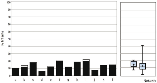
Comparison and benchmarking of several centres (perhaps regional networks or national collaborations) can be represented by a combination of bar charts and box-plot and whiskers. In Fig. 6.4, mortality (or any other key performance indicator) can be represented as two charts placed side by side. The left chart provides bars with the data for the individual centres within a regional or national collaborative group while the right side provides information about the overall distribution in the form of one or two boxplots. A boxplot is a graphical representation of the distribution of a set of observations. It resembles a rectangular box with a pair of whiskers extending from its ends. The “whiskers” represent the extremes of the data (minimum and maximum), while the box represents the central portion of the distribution. The top edge of the box represents the 75th percentile of the distribution and the bottom edge of the box represents the 25th percentile of the distribution. By definition, 25 % of the centres have event proportions at or below the 25th percentile (the bottom edge) and 25 % have event proportions at or above the 75th percentile (the top edge). The remaining 50 % within the box represents the middle 50 % (from the 25th to the 75th percentiles) of the hospital proportions for each group. The line across the middle of the box represents the median (50th percentile). Half of the centres lie at or below this line and the other half lie above it. Finally, the cross represents the mean value of all of the hospitals.

Fig. 6.4
Mortality Bar Chart with Box-Plot and Whiskers. (Annual Group Report. Burlington, VT: Vermont Oxford Network, 2012
Even when a comparison is appropriately risk-adjusted, there are important cautions about interpretation, including the source of the reference (benchmark) population, sample size, and biases from incomplete risk adjustment [18].
Plan-Do-Study-Act Cycle
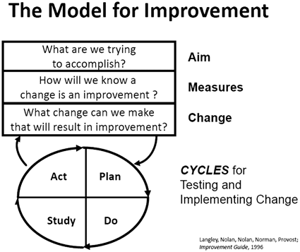
The Plan-Do-Study-Act (PDSA) cycle (Fig. 6.5) is part of the IHI Model for Improvement, for accelerating quality improvement [25]. Once a team has set an aim, established its membership, and developed measures to determine whether a change leads to an improvement, the next step is to test a change in the real work setting. The PDSA cycle is shorthand for testing a change—by planning it, trying it, observing the results, and acting on what is learned [26]. This is the scientific method, used for action-oriented learning .
Stay updated, free dental videos. Join our Telegram channel

VIDEdental - Online dental courses


