Light and Colour
Increasing emphasis is being placed on cosmetic dentistry, essentially the invisible repair of teeth. This ‘invisibility’ requires that the optical properties of colour, gloss and translucency of tooth substance be reproduced in the restorative material. The factors concerned in this, and the conditions under which it may be obtained, involve understanding the nature of colour.
Colour itself is a product of the interpretation by our brain of physical stimuli. Discussion of the factors and conditions relevant to colour matching involves defining the terminology and the nature and dimensions of colour. The roles of the absorption of light by the object and the spectrum of the illumination are explained, as well as the interactions between them. Understanding of these basic principles is necessary to deal with the issues affecting colour matching in practice, as applied to the real problems of shade selection.
Other physical attributes of materials also affect the optical appearance of materials. The most important of these is refractive index, and the effects operating at boundaries. This has implications for the design of materials, and the effects of faults and surface conditions, especially roughness.
The chemical basis of colour is also outlined in terms of the absorption (and emission) of light. This bears on the means of colouring various types of material, and also their colour stability over time.
Colour is another topic that is generally neglected but yet is an important issue, affecting as it does the conditions under which shade matching is undertaken. Comprehension of these issues is necessary to avoid the wastage of effort in high–value cosmetic dentistry.
Whilst a major role of dental treatment is to restore form and function to the dental apparatus, rehabilitation, the vanity of man is such that merely functional restoration is often insufficient and the appearance of the prosthesis, be it anywhere from fissure sealant to full denture, assumes great importance. ‘Aesthetic dentistry’ is a greatly overworked phrase, for it surely depends on the eye of the beholder and opinions differ: black denture teeth found favour in at least one country, gold work is often prominently displayed, and a diamond has been seen worn in at least one upper central incisor. As appearance (or, at least, intended appearance) is the wearer’s choice, the term ‘cosmetic dentistry’ is perhaps more honest. This includes ‘tooth whitening’ – noticing that natural teeth are not truly white – and which often represents an attempt to change appearance to match some perceived but unrealistic ideal. A quick glance at a dental shade guide will convince you of this. However, both terms are frequently interpreted as meaning only reproduction of the appearance of natural tissue so that the restoration is undetected by onlookers in day to day life. Clearly, if that is the case, neither term is being used properly. If, however, we accept that the matching of the colour and other optical attributes of a restoration to those of the replaced or surrounding tissue is a worthwhile goal, which seems not to be a difficult proposition, then the nature of colour, its generation, and the factors that influence its perception, should be understood. This is to enable the practitioner to achieve several goals.
Firstly, the ‘taking of a shade’ is a critical process upon which patient acceptance depends. Secondly, limitations to the quality of the match that can be attained need to be understood to inform the selection of material. Thirdly, the patient needs to receive advice on what can be achieved and what is to be expected, especially when a material may show age-related changes in appearance. A related problem occurs in connection with tooth whitening when restorations of any type are present: it is extremely unlikely that there could be any change in the restorative material to match that in the teeth. This would leave the restorations rather obvious, presumably requiring replacement, which could be a very expensive proposition. Fourthly, appearance is affected by the surface condition (scratches) and internal structure of a material (e.g. porosity) and is therefore under at least some control in terms of finishing treatments and perhaps mixing.
§1 The Sensation of Colour
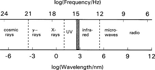
‘Light’ is generally understood to be electromagnetic radiation which may be detected by the receptors of the human eye, although no actual physical distinctions can be made to identify that particular portion of the continuous spectrum which ranges from extremely low frequency radio waves to gamma rays (Fig. 1.1). It is of course ‘visible’ only because of the simple chemical fact of the energy of the radiation being able to reach those receptors and be absorbed at the sensitive organelle. Indeed, no distinct boundaries between portions of the visible spectrum (i.e. ‘colours’) can be drawn sharply anywhere. In fact, what wavelength range is visible varies widely between species. All of the many designations are essentially phenomenological; that is, the labels are applied according to the spread of wavelengths associated with particular kinds of physical effects. Visible light then is no more special in this regard than any other region.
Our brain can utilize the information provided by the eyes to build up information about the disposition and nature of the immediate environment, coupled with other sensory input. As far as light is concerned, however, we may also distinguish a set of independent characteristics which are interpreted as the psychophysical sensation of colour. The term psychophysical means that colour is not, of course, a real physical attribute of radiation in the sense that frequency and wavelength are. Rather, it is an interpretative artefact of the brain, the psychological response to the physical stimulus. Thus, when we refer to the ‘colour’ of light, this interpretation will be taken as understood.
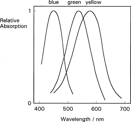
The present discussion is restricted to vision dependent on the retinal cone cells, photopic vision, as the rods do not permit colour perception. Those cone cells comprise, in ‘normal’ colour vision, three distinct types, sensitive to different regions of the spectrum; the peak sensitivities lie respectively in the red, green and blue regions (Fig. 1.2). Notice that it is the relative intensities of the responses (output signals) that provide the colour information. There are, therefore, only two degrees of freedom for assigning ‘colour’ since of the three comparisons, red vs. green, green vs. blue, and blue vs. red, only two need to be specified to determine the third, i.e. only two are independent (we are ignoring total intensity) (cf. the equivalent discussion of independent equations in 8§3.4).
•1.1 Colour gamut
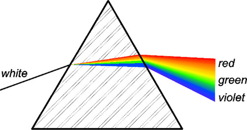
It is well known that a range of colours, the (visible) spectrum (the colours of the rainbow), may be obtained from white light by using a prism (Fig. 1.3) or diffraction grating. However, this range is also very evidently only a very small part of the total colour gamut, the complete range of colours that can be created or perceived by humans. In fact, about 10,000,000 detectably different colours exist for anybody with ‘normal’ colour vision,1 and it is immediately obvious that most of these are not spectral, meaning that they do not correspond to the colour of any single wavelength. What is not so obvious is how these other colours arise, and it is now necessary to explore some aspects of colour science in order to understand the implications for dentistry. We shall do this by describing the results of some simple experiments.
We shall of necessity have to restrict the following discussion to normal human trichromatic vision, or trichromacy. There are, of course, various types of colour vision defect[1], and even rare instances of tetrachromacy (which also occurs in various other species). What follows can be extended easily in a natural way to cover such circumstances, as no principles are critically dependent on trichromacy as such, should the need arise. Even so, it would be wise to bear in mind the possibility of defective colour vision (‘colour blindness’) in the context of cosmetic dentistry and colour matching in general, for the patient certainly but especially for the dentist, given that (depending on region) as much as 10% of the population may be affected in some way.
•1.2 Visual matching
Suppose that we illuminate a portion of a white2 screen by a lamp, which can be arbitrarily chosen but for example an ordinary tungsten filament bulb, such as can be done with a slide projector or theatrical spotlight. Three other such lamps are then set up to be able to illuminate (only) the adjacent portion of the same screen. These other three lamps have widely different colours (for example, but not necessarily, red, green and blue), the brightness of each of which is independently adjustable (as by an iris diaphragm – as will be explained below, changing the voltage on a filament lamp will change the colour). These lamps can have their colours determined by selectively absorbent filters or any other appropriate means. The set-up is illustrated in Fig. 1.4. By trial and error it will be found that a perfect colour match can be produced, i.e. the light in the second portion of the screen will look as ‘white’ as that from the tungsten bulb; indeed it will be quite indistinguishable – by eye. Any small adjustment in the brightness of any of the three coloured lights will result in a distinct colour in the illuminated area. This experiment indicates that, as would be expected from the discussion above, ‘white’ is not really a property of the light as such but a particular response (on our part) to a particular set of stimuli. Furthermore, it does not matter how the lamp colours were established: the match can always be made perfect.
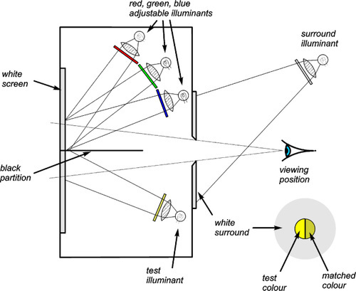
If now one of the three coloured lights is turned off altogether (say the blue), adjustments of the other two will be found to produce only colours varying between green and red, with yellow as an intermediate colour. With the presently assumed lamps, or illuminants – to make it more general, under no conditions will white be produced, and certainly blue will not be approachable. Equivalent remarks may be made for the other two pairs possible. The sensation of colour is thus said to depend on three stimuli; the total illumination of the test screen is certainly three-dimensional. However, if we were very careful (and it is a difficult experiment to perform), two illuminants could be found which would allow white to be produced, that is, with an appropriate ratio of intensities. This requires, in addition, for an arbitrary first illuminant, a very precise selection of the colour of the second. This is equivalent to the situation described above: having found a perfect match using any three illuminants, only one is then allowed to vary in intensity, the other two establish in effect a single but mixed-colour illuminant. More than three coloured lights could be used to obtain a match, but in general no less than three will do.
This outcome can be related directly to the fact that there are three separate detectors in the eye (Fig. 1.2). Three signals are generated, and information on the relative strengths of these three must be necessary to define a colour.
•1.3 Mixture diagram
What we are really dealing with is a three component mixture, and diagrams of the type shown in Fig. 8§1.6 can be used to plot the results of such mixtures.[2] These diagrams are generally called a colour-mixing triangle (Fig. 1.5). Notice that in such diagrams it is the proportions of the components which are relevant, not the total intensity. A wide range of colours is capable of being reproduced by such a system. Indeed, it is the method employed in colour television and computer screens to produce the image, as close inspection will show (it often comes as something of a surprise to see that the three coloured dots are red, blue and green – get up close with a magnifying glass). Photographic colour film uses exactly the same principle, but with coloured dyes which act as filters.
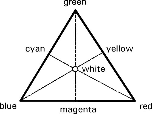
This diagram also indicates some pairs of complementary colours, i.e. those which in appropriate intensity ratios will generate white. These are indicated by the ends (as well as intermediate points) of all lines which may be drawn through the white point.
However, and significantly, there are always some colours which cannot be reproduced by any such system. This leads to limitations on the image quality of both televisions and photographs, no matter what the advertising says about true-to-life colours. Rainbows in particular are always disappointing because they are spectral colours and cannot be reproduced. This failure needs explanation.
§2 The Chromaticity Diagram
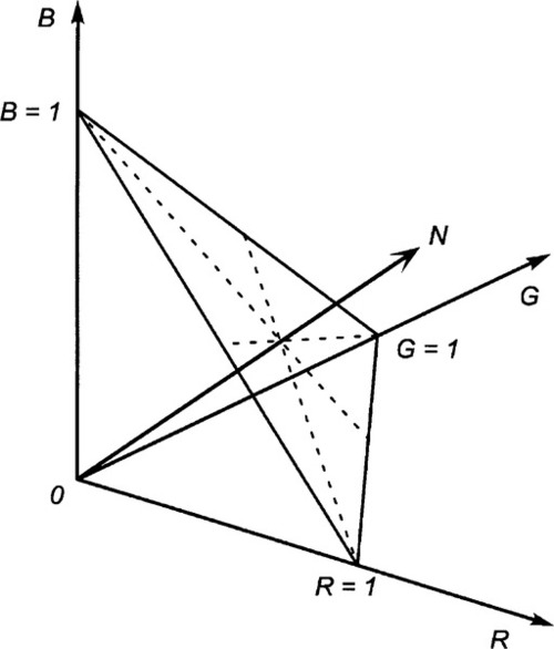
The tri-stimulus nature of the colour response has been stressed, so that the representation graphically of any particular combination of lights at specified intensities requires a three-dimensional plot. However, if we are concerned only with the proportions of each component, we can restrict our interest to the one plane where the sum of the photometric intensities R + G + B = 1, the so-called unit plane (Fig. 2.1). The ‘composition’ of the colour can be determined from the unit plane triangle in precisely the way that the composition of mixtures of three chemical components can be determined (8§1.2), relying on the idea of the perpendicular distances from the sides of the triangle representing proportions (Fig. 2.2). In other words, this is a colour mixing triangle for the chosen set of lights.
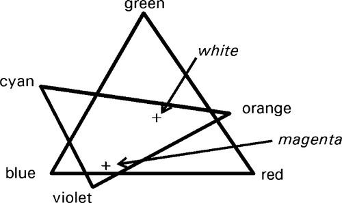
Now, supposing we do exactly the same thing with a new set of different coloured lights (say, orange, cyan and violet) we would then have created a second colour mixing triangle. Then, using the set-up of Fig. 1.4, and replacing the lower lamp by the second set of coloured lights, we may be able to find a colour – for example, white – using the first set that we can match with the second set. The corresponding points can be plotted in the two diagrams. We go on to seek a second colour using the first set, say, magenta, that we can match with the second set. We again may plot the corresponding point in each diagram. This situation is then similar to that shown in Fig. 2.3. However, we know that these colour points in the two diagrams are matched. By rotation and scaling the second diagram we can arrange for the two matched points to be superimposed. We would then find that all points common to the two triangles – that is, lying in the overlap area – correspond to colours that can be made by mixing either set of illuminants. Furthermore, all such points coincide in the new diagram (Fig. 2.4).
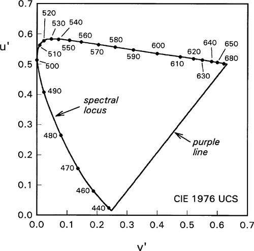
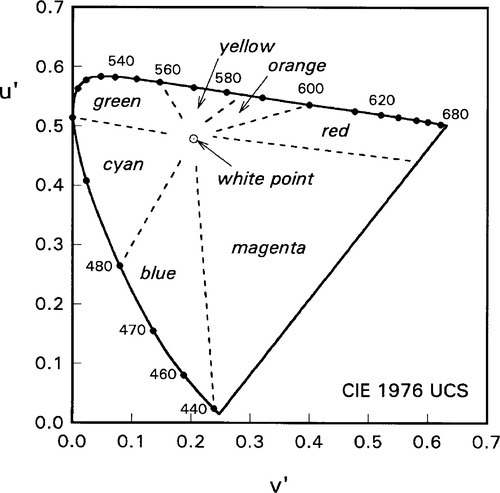
•2.1 Spectral locus
If we were to continue creating and overlaying colour mixing triangles, using as wide a variety of illuminants as possible, we would gradually build up a map covering more and more of the colour gamut (Fig. 2.5). If we included in our list of tested illuminants the pure spectral colours, single wavelength lights (such as from a laser), after overlaying to match colours we would find that the spectral colours formed the outer boundary of the available colour gamut. This boundary is called the spectral locus, and the wavelengths of the spectral colours will be found to lie in order along it, although not on a uniform scale. Bear in mind that we are dealing with the psychophysical effects of light, and strict ‘calibration’ of our perceptions in wavelength – or frequency – could not be expected. No matter what illuminants we test, none will be found that will lie outside that boundary after the colour mixing triangle has been matched and overlain properly (Fig. 2.6).
•2.2 Chromaticity coordinates
Now, quite obviously, no single set of three illuminants can correspond to a colour mixing triangle that will give the entire colour gamut; no amount of scaling will change the shape of Fig. 2.6 to a triangle and maintain the proportionality requirements for plotting in that area. In other words, there are always colours that cannot be reproduced using any single set of three arbitrary ‘primaries’, even if these primaries are themselves pure spectral colours, i.e. single wavelength light which is by definition pure.
Obviously, if the spectral locus is to be plotted in a plane, there is a region outside it totally inaccessible through the mixing of any real illuminants. Subject to the condition of existence, therefore, colours may be identified in terms of rectangular coordinates.
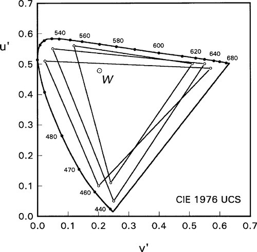
What this in effect means is that an arbitrary mixing triangle for three imaginary illuminants (which do not and cannot exist), can be drawn to enclose the spectral locus (and this is in fact done in some in some colour definition systems). Even so, it is far easier to specify any point within the colour gamut by rectangular coordinates, conveniently chosen. These are then called the chromaticity coordinates. (In fact, the diagram is scaled better to match human perceptions of the ‘distances’ between colours. The resulting, arbitrary coordinates are labelled v’ and u’.)
The line which closes the colour circuit, joining the red and blue ends of the spectral locus, is known as the purple line (Fig. 2.7). Colours along this section range from red through magenta to purple and violet, following the rules for a mixture line (8§1.1). However, these are not spectral colours, and can only be created as mixtures. Clearly, since the ends of the spectral locus are the limits of attainable spectral illuminants, the purple line is also an unpassable boundary: no colour exists outside it. This then completes the chromaticity diagram (Fig. 2.7).[3]
Note that although it is possible to specify coordinates that lie outside the colour circuit, they do not correspond to realizable colours. Even so, it is noteworthy that the range of wavelengths said to be visible is not clearly defined. Estimates of the long wavelength limit vary between about 680 – 740 nm, while the short wavelength limit is given variously between about 380 and 430 nm. This clearly depends on individual sensitivities, some may see further into the red or blue, or both, than others. Thus, the purple line may assume different positions for these people. Nevertheless, the remainder of the diagram and all the observed effects and phenomena will remain unaffected by this.
•2.3 Colour map
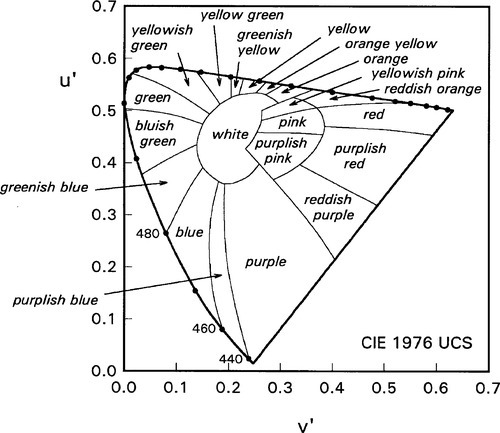
The common named colours can now be mapped onto this diagram (Fig. 2.8), where conventional boundaries are identified by spectral wavelength. This can be seen to be insufficient for anything other than elementary work, and more detail can be added to take into account finer distinctions (Fig. 2.9). Even so, this is still not very precise, but it would rapidly become unwieldy if the process of subdivision were continued. It therefore becomes apparent that what is required is a formal means of specifying colour in a manner that is reasonably easy to interpret in terms of the psychophysical sensation, as opposed that is to the arbitrary scales of the CIE diagram. Some of the systems that have been developed are outlined in the next section.
No phosphor or dye can yield a pure spectral colour, so approach to the spectral locus is limited. However, the general convexity of the spectral locus ensures that no spectral colour can be created as a mixture of any other two, except perhaps in the red to yellow region. This means that, in general, a mixture line between two such pure colours cannot reproduce the appearance of intervening spectral colours, except where the locus is itself quite straight. These unavailable colours are said to be outside the gamut of the three particular stimuli chosen in the kind of experiment illustrated in Fig. 1.4. In the case of Fig. 1.5, for example, certain strong yellows, a range of greens, and violet to purple colours simply could not be produced.
The situation of two illuminants being used to create white can now be mapped more precisely. For any arbitrary first light, there is only one line that passes through the white point; the second light must therefore lie on this line, but on the other side of the white point (Fig. 2.6). The special conditions attached to this possibility do not diminish the effect of the conclusion that colour as we sense it is best described as a tri-stimulus phenomenon.
•2.4 Weighted mixtures
In reaching the above conclusions we have only considered taking illuminants three at a time to create separate colour mixing triangles. What happens if we have four – or more – illuminants? Remember that if we take a pair of illuminants the result of mixing them is represented as a point on the mixture line joining their plotted positions. This is a weighted mean of the two illuminants, weighted by their intensity proportions. But this new point is itself equivalent to an illuminant, and we may repeat the process to calculate the corresponding mixture of this with the next illuminant. Ultimately, this process repeated will produce a weighted mean for any number of illuminants acting together, including the situation where all wavelengths are represented. We could, of course, have taken the illuminants in threes, using mixture triangles, to achieve exactly the same result. There are then many ways in which ‘white’ can be created, including the particular case of all wavelengths being represented uniformly.
§3 Colour Specification
•3.1 Saturation
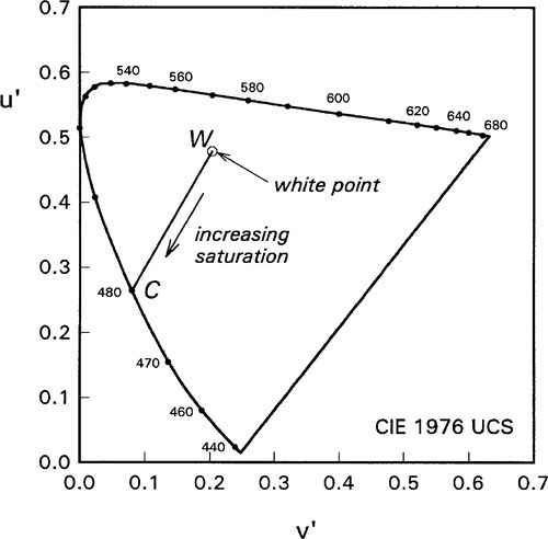
The coordinate system of the chromaticity diagram is not very intuitive: the use of a coordinate pair does not lead to a good conception of the colour involved despite the technical advantages of a cartesian (rectangular) coordinate system map and, as we have seen, the use of word labels lacks precision. Several alternative approaches have been offered. They all take as the natural point of reference or origin the white point which represents, by definition, an absence of perceived colour. On the other hand, the strongest colours (what we may consider the most extreme illuminants physically possible) are those which lie on the colour circuit, the spectral colours themselves or the purple line mixtures. Thus, there is a gradation from white, through pastel shades, to what is termed a saturated colour. White is therefore the least saturated colour possible; indeed, its ‘saturation’ is defined as zero. The measure of saturation for a colour at a given point is therefore the relative distance along a line drawn from the white or neutral point to the colour circuit through that point of interest (Fig. 3.1). This is, in itself, a mixture line, where the two components are white and the saturated colour.
•3.2 Hue
To specify saturation is not enough. Since we are working in the plane, two values need to be specified, and in this case it is the direction to be taken in moving away from the neutral point. This corresponds to specifying wavelength (or frequency) on the spectral locus. We already have common names for the spectral colours: red – orange – yellow – green – cyan – blue – violet (cf. Fig. 2.8). Adding to this list, in order anticlockwise around the colour circuit, purple and magenta, we can specify the type of colour or hue in a natural manner that is easier perhaps to comprehend than wavelength. This kind of mapping is similar to a polar coordinate system: distance from centre and direction. Thus, in Fig. 3.1, W is the neutral point, C is a saturated colour (in this case, blue), while all points in between are whiter or paler or less saturated versions of the same hue.
•3.3 Grey scale
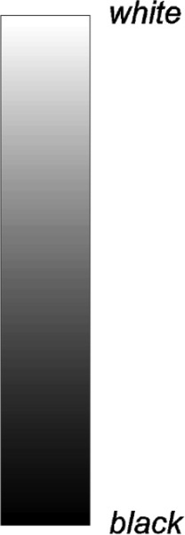
Notice that the photometric intensity of the illumination is not discussed (except to say that it is constant). This is because, except at extremely high levels when discomfort is involved and at low levels when scotopic vision starts to take over (i.e. the rods are doing the work), the psychophysical sensations of colour change very little, if at all. In addition, we have only discussed the appearance of the illumination of an assumed perfect diffusing surface, i.e. a ‘white’ screen. However, it is evident that ‘absence of colour’ has another dimension in that we are aware of shades of grey, ranging from a totally absorbent, non-reflective black to a totally diffusing pure white. Again, this is without reference to the actual amount, the photometric intensity of the light falling on the object.
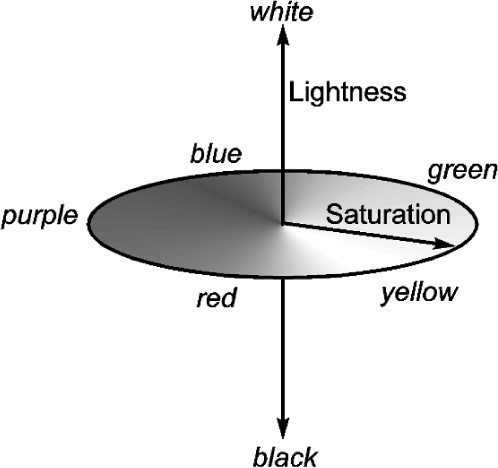
It is necessary then to introduce a further dimension to complete the statement of the colour of objects: the lightness or grey scale value (Fig. 3.2). (Plainly this cannot apply to the illuminants themselves – ‘grey light’ does not exist.) If we have plotted hue and saturation in a plane, the lightness dimension is normal to it (Fig. 3.3). This means that we are working in what is called a cylindrical coordinate system: direction and distance from the centre in a plane, and the height above or below the plane. Since therefore the range of the neutral colour is from black to white, we may represent this in terms of the overall reflectance of the object, which value can then range from 0 to 100% of all that impinging on it. (This property is also sometimes called the albedo of a surface or body.) It is therefore an absolute, not subjective, measure.
Notice that for us to judge that something is grey requires an object for comparison. Imperfection in whiteness can only be detected by comparison with a whiter object. In low light conditions, for example, this page appears ‘grey’. But what is the colour of a shadow on ‘white’ paper?
•3.4 Differential absorption
We have assumed, indeed required, for the experiments illustrated by Fig. 1.4 that there is no selective or differential absorption of the various wavelengths of the light impinging on the screen – that is why it is ‘white’. When we consider shades of grey the requirement is that all wavelengths are uniformly absorbed, which also means uniformly reflected. In this way the saturation remains zero and the colour neutral for white illumination, no matter what its spectral make-up. But, it is evident that many objects are coloured even though they are illuminated by white light.
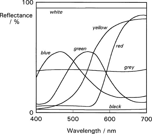
Let us, for the moment, assume that the phrase “white light” means that all wavelengths are equally represented, i.e. uniform photometric intensity. The weighted mean of these in the chromaticity diagram therefore lies at the neutral point. But if the object illuminated absorbs any wavelengths preferentially, in general the weighted mean of the reflected light will no longer lie at the neutral point. This means that the saturation will have increased in the direction of some hue, and typically away from the hue of the light which has been absorbed. The colour of the object under white light illumination is therefore determined by the relative proportions of the different wavelengths which are reflected. Thus, the colour of objects in general arises from differential absorption. How this may work in practice can be seen in plots of reflectance vs. wavelength, such as might be obtained from a scanning spectrophotometer, so-called reflectance spectra (Fig. 3.4), where the reflectance indicates the proportion of incident light at each wavelength that is not absorbed. Thus, a ‘red’ object tends to absorb yellow to blue wavelengths, a ‘green’ object both blue and red wavelengths, and so on.
In summary, the colour of an object – hue and saturation – depends on the weighted mean (§2.4) of the reflected light, as plotted in the chromaticity diagram, while the grey scale value or lightness depends on the overall reflectivity of the object, without regard to wavelength.
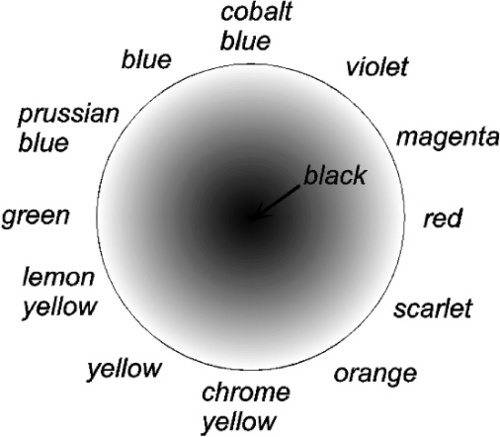
The colour mixing triangle of Fig. 1.5 may be seen in effect to operate as an ‘additive’ colour diagram, the addition being of the lights impinging on the screen. In a complementary sense there are also ‘subtractive’ diagrams, which are used for paints, artists’ colours and pigments in general to indicate what might be expected when they are mixed (Fig. 3.5). These two diagrams differ, in part, in having respectively white and black at their centres as the neutral colour. However, although pigment formulation may require such concepts, and this could be relevant to the colouring of dental porcelain for example, as far as the eye is concerned it remains the total wavelength mixture that is received which is important, as is apparent from Fig. 3.4.
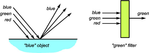
Similar subtractive processes are operating in filters, where we would speak of transmission spectra, the essential similarity between filters and pigmented opaque objects (Fig. 3.6) being the spectral composition of the light received by the eye. In each case it is the intensity weighted mean of all the wavelengths present that determines what is perceived as the colour.
There are several other ways of describing colour.[4] These have been developed for particular purposes but are necessarily still based on the ideas of illuminant mixing and so on described above. Since some of them at least may be encountered in dental contexts, they are described briefly.
•3.5 Munsell system
One of these colour specification schemes is the proprietary Munsell system, an elaboration of the scheme shown in Fig. 3.3. This takes into account the sensitivity of the perception of saturated colours at both high and low lightness. Clearly, any colour that is very light cannot simultaneously be very saturated, because this would require that the albedo is higher than the proportion of, say, red light in the white illuminant. Likewise, something that is very dark, not returning much light from the white illuminant, cannot also appear to be saturated – it simply is not seen. The Munsell colour space is therefore a kind of distorted double cone (bases together), the apices being white and black respectively. The direction relative to the black-white axis is still termed Hue (although, oddly, labelled in a clockwise direction), but saturation is now called Chroma, while lightness is termed Value (i.e. grey scale value) (Fig. 3.7). The notation is brief and easily understood. This therefore is still a kind of cylindrical coordinate system.
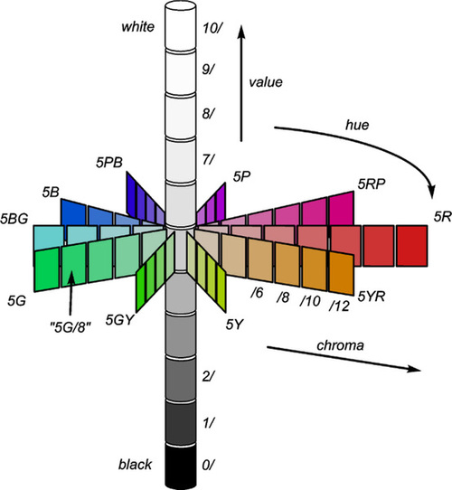
The Munsell system is very useful for colour matching purposes as sets of colour ‘chips’ with specific hue, chroma and value have been prepared. These are used directly for colour determination by eye matching rather than by an instrument. For example, they are useful for hair, skin and mucosa. The latter would be relevant to the selection of an appropriately matching denture base acrylic (although it is noticeable that the range of colours offered commercially for such products is very small).
A variant of this system is called the HSB model, that is Hue, Saturation, Brightness. Hue is described by the angle around the circle, 0° being red, proceeding through yellow at 60°. Saturation is dealt with as a percentage from 0 to 100, as is brightness. It can be seen that the colour maps of the Munsell and HSB systems do not overlay on each other exactly, even though conceptually similar.
•3.6 CIE L*a*b* system
This is more likely to be encountered in connection with colour meters. The light returned from the test object on illumination with a white light (such as is obtained from a photographic flash) is analysed with a set of filters and then described by three numbers: L* is the lightness value, while a* and b* are the coordinates in red-green and blue-yellow axes respectively. This therefore is a three-dimensional rectangular coordinate system for the colour space, the origin of which lies at the neutral black point. There are a number of variants of this kind of scheme.
•3.7 RGB system
This is normally used for defining the colour to be displayed on television and computer monitors, and similar light-generating equipment. As mentioned above, a colour monitor has three light emitters, red, green and blue (corresponding to the RGB of the name). The intensities of these three primary colour components determine the overall colour, through a mixing triangle such as Fig. 1.5, as well as the overall intensity. However, because no triangle can cover the entire colour gamut, as explained above, there remain colours which cannot be specified in such a fashion – they are, anyway, incapable of being created by those emitters.
•3.8 CMYK system
Colour printing, on the other hand, in its simplest form, employs dots of varying size of Cyan, Magenta and Yellow inks (see Fig. 1.5) (with blacK to adjust grey scale value, so-called four-colour printing), as can be easily seen with a hand lens. This, of course, is a subtractive system, but the same limitations on the gamut available apply. In addition, because it is subtractive, the seemingly odd selection of ‘primary’ colours is necessary to obtain an appropriate range: red plus green ink makes black, not yellow.
There is a significance in both RGB and CMYK systems for dentistry. On the one hand, there could be errors in the colours that would be found if comparison were made of a real object with a colour monitor image, if it was desired to demonstrate colour matching with such equipment in the surgery. This would not be because the unsaturated colours appropriate for teeth and so on could not be made, but because it would demand accurate calibration of the screen (i.e. of the intensities of the output of the electron guns or LEDs, for which purpose special devices and software are available), and this would also depend on ageing effects in the light emitters and driving electronics (requiring regular checks). An indication of the problem can be gained from displays of televisions in shops: rarely do two have the same colour balance! A further problem is that with LED displays the perceived colour depends on viewing angle, sometimes quite markedly, and for only small angular changes. On the other hand, there are difficulties in making an accurate printed shade guide because of the high accuracy required for the amount of ink in each dot. High quality colour printing is expensive (and in fact may employ more than three colours to achieve good saturation and range of hues), but paper is a relatively fragile medium that does not lend itself to sterilization. In addition, printing ink dyes are fugitive, fading in time (§6.3).
Each of these colour systems is, of course, dealing with the specification of colours from the same overall set. Conversion between them is therefore possible, using various formulae, but this has no immediate dental relevance. Ultimately, dentistry is mostly concerned with the problems of colour matching, as exemplified by the use of a ‘shade guide’, such as is used for restorative materials.
•3.9 Colour space
Although there are three coordinates in, for example, the Munsell system, which may be specified independently, there are combinations which have no meaning. This excluded region has already been mentioned (§3.5), but it is worth emphasizing that this is a general condition, not relevant to only the one system. Just as there is an ‘inaccessible’ region outside the colour circuit (Fig. 2.7), so there are non-existent colour specifications outside the double-cone of the full colour space (Fig. 3.8). It should be clear that a colour cannot simultaneously be fully-saturated and have either maximum or minimum lightness, indeed it follows that any deviation in the lightness direction for a fully-saturated colour is disallowed, remembering that lightness is not photometric intensity.
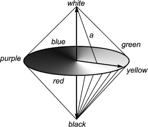
The effect can be envisaged by considering the double-cone to be defined by the full series of mixture lines from the apices to the saturated circuit, for example white-purple, or black-yellow. Saturation therefore decreases as lightness increases. Similar mixture lines for unsaturated colours can also be considered, such as line a in Fig. 3.8.
•3.10 White
It is worth reviewing the meaning of ‘white’ at this juncture as it has three distinct senses in the development above, according to context:
• White light – an illuminant with all wavelengths equally represented, i.e. a flat spectrum.
• White perception – the end result of the eye receiving light whose weighted mean lies at the neutral point, i.e. which has zero saturation.
These aspects are respectively a physical property of a material body, a spectral description of an illuminant, and the psychophysical outcome of seeing a particular spectral profile. Thus we may perceive as white a non-white object under a non-white illuminant when the weighted mean of the returned light is neutral.
§4 Colour Matching in Practice
The discussion so far has centred on the background of the identification and mapping of colour. It is now necessary to consider the practical implications and use of this in the process of colour matching, especially as it relates to the use of shade guides in the selection of a restorative material.
•4.1 Principles of colour matching
The description above of the nature of the psychophysical sensation of colour can be summarized in three general principles.
2. Weighted mean: The perceived colour depends on the intensity weighted mean of the illu/>
Stay updated, free dental videos. Join our Telegram channel
VIDEdental - Online dental courses