14: OVERVIEW OF BIOSTATISTICS

CHAPTER 14 OVERVIEW OF BIOSTATISTICS

As a practitioner and teacher of biostatistics, I have often wondered what the branch of mathematics known as statistics ever did to warrant such a contemptuous remark from Sir Benjamin Disreali, friend and confidant of Queen Victoria and prime minister of England. Disreali died in 1881, but his distrust of statistics has survived the nineteenth and twentieth centuries, and it lives today in the twenty-first. In nearly every group of biostatistics students who grace my classroom, at least one student poses the challenge: “But can’t you make statistics say whatever you want them to say?” It is the goal of this chapter to introduce the reader to the sound principles of biostatistics and their proper application to dental research data. In the process, it is hoped that any lurking fear of biostatistics will be replaced with the realization that biostatistics is a powerful ally in the quest for the truth that infuses a set of data and waits to be told.

Dental health professionals have a variety of uses for data: for designing a health care program or facility, for evaluating the effectiveness of an oral hygiene education program, for determining the treatment needs of a specific population, and for proper interpretation of the scientific literature, to name just a few. In these instances, data are helpful only to the extent that these sets of data may be summarized and interpreted. Thus evidence-based decisions can be made about the results of research, program evaluation, or needs assessment. These tasks that we ask of data illustrate the two major divisions of statistics: descriptive statistics and inferential statistics. Descriptive statistical techniques enable researchers to numerically describe and summarize a set of data; inferential statistical techniques provide a basis for testing hypotheses and applying statistical results to the group of individuals or objects that form the population of interest.

DESCRIPTIVE STATISTICS

Population Versus Sample

A population is any entire group of items (objects, materials, people, etc.) that possess at least one basic defined characteristic in common. Examples of populations might be all dentists, all U.S. citizens, all periodontally involved teeth, all individuals in a given school, or all patients treated at a particular private office. It is often impossible to collect information from an entire population because of the size of the population or because of such limitations as finances, time, or distance between population members. In cases in which it is impossible to collect data on the entire population, complete and reliable information can be collected from a representative portion of the population termed a sample. By observing and measuring a sample, it is possible to obtain information and make statements about the total population.

Statistics is a science that describes data for the purpose of making inferences about the population from which the data are obtained. When we collect a specific piece of information—data—from each member of a population, we obtain a characteristic of the population termed a parameter. Similarly, when we collect a piece of information from each member of a sample, we obtain a characteristic of the sample termed a statistic. Because most studies are conducted by using samples, statistics rather than population parameters are most commonly used. Using statistics (characteristics of a sample), we try to infer what the parameters (characteristics of a population) will be.

Random Samples

Samples, by definition, cannot have exactly the same characteristics as a population. However, a sample that is truly representative of the population can be obtained by using probability sampling methods and by taking a sufficiently large sample.

A random sample is defined as one in which every element in the population has an equal and independent chance of being selected. The following example illustrates two random sampling procedures: assume a population of 5000 seniors in the predental program at 50 universities. Each senior class has 100 predental students divided into five equal sections of 20 students each. The objective is to determine the grade point average (GPA) of each predental student by selecting a representative sample of 1000 students (i.e., a sampling ratio of one fifth, or 20%). A simple random sample to select the 1000 students would be completed in the following manner: a list of 5000 students must be compiled and numbered 1 through 5000. A numbered tag is prepared for each student. From the 5000 well-mixed tags, 1000 are drawn by a lottery. After each selection the tag is replaced and another tag is drawn. This is the most basic random sample approach.

A similar procedure may be applied for selecting a random sample by using a table of random numbers, which can be found in most statistics textbooks. For this example, it would be necessary to use four columns of digits in the tables so that each student, 1 through 5000, would have an equal probability of being selected. Selection would begin by blindly identifying a number on the table that corresponds to a member of the total population (1 through 5000). The selection process continues by taking numbers horizontally or vertically until the desired sample size is reached. Repeated numbers are omitted when encountered during sample selection in both procedures.

Random sampling is the procedure of choice whenever possible. It prevents the possibility of selection bias on the part of the researcher. What if GPA is related to school? A simple random sample may not ensure representation of the entire population of predental students. It may be necessary to select individuals according to certain strata or subgroups to diminish the chance of sample fluctuation. This method of selection is termed stratified sampling. It is accomplished by randomly selecting a proportionate number of subjects from each subgroup for the sample. In the preceding example the subgroup would be the university attended. To produce a stratified random sample, one would (1) prepare a list of students at each of the 50 universities and (2) draw at random one fifth of the students at each university. Because the sampling ratio is used in each stratum, there is a proportional allocation by school. This eliminates the possibility of sampling bias, which could result by selecting at random and giving no consideration to school.

Another type of sampling is the systematic sample. A systematic sample is not a true random sample because everyone may not have an independent chance of being selected. This type of sample is usually obtained by drawing a number and then selecting every nth individual, for example, having a list of names and deciding to test every even-numbered person on the list. All odd-numbered names are systematically excluded.

Two types of samples that may introduce serious bias in estimating population parameters are (1) the judgment sample and (2) the convenience sample. In a judgment sample someone with knowledge of the population may select a sample in arbitrary ways to represent the population. In a convenience sample a group is chosen because it happens to be convenient and may represent the population; for example, one classroom within a school is selected because the teacher gives permission to work with the pupils, or the patients at a particular private office are used because the dentist allows access to the patient list. Results relating to that particular classroom or that particular dentist’s office may be valid, but when generalized to include the larger population of school classrooms or dentists’ offices, their reliability is questionable.

Once a sample has been selected, data are collected according to the study protocol, and consideration must then be given to data analysis. As previously stated, the statistical analysis of data requires the application of the principles of descriptive statistics and hypothesis testing. Before presenting these principles, we must first answer the general question: What are data?

Scales of Measurement

In general, data are any information that can be collected. Name, address, job title, social security number, age, gender, income, height, and weight are examples of data. Though not all data are represented by numbers, this discussion is limited to numerical variables. Before one can determine the appropriate methods for summarizing and displaying data, it is necessary to understand the nature of the variable of interest, that is, its scale of measurement. The type of data also plays an important role in deciding which statistical procedures to apply in a test of a hypothesis. The two major scales of measurement are the following classifications: categorical (enumeration) data and continuous data (measurements).

DISPLAYING DATA

Frequency Distribution Tables

To better explain data that have been collected, the data values are often organized and presented in a table termed a frequency distribution table. This type of data display shows each value that occurs in the data set and how often each value occurs. In addition to providing a sense of the shape of a variable’s distribution, these displays provide the researcher with an opportunity to screen the data values for incorrect or impossible values, a first step in the process known as “cleaning the data.” Routinely, data analysts generate a frequency distribution table for every variable that is recorded in a research project.

The construction of a frequency distribution table is straightforward and easily accomplished with standard statistical software. The data values are first arranged in order from lowest to highest value (an array). The frequency with which each value occurs is then tabulated. The frequency of occurrence for each data point is expressed in four ways:

The following example illustrates this descriptive display of data. A group of 33 dental students has taken Part I of the National Boards examinations. Their examination scores have been recorded. The dean of the dental school wishes to summarize these scores at the next school faculty meeting. Here are a few of the ways that the information could be presented.

First, an ungrouped frequency distribution table of the National Board scores is presented in Table 14-1. The variable of interest is the examination score, which is shown in the first column of the table. The examination scores for the group are listed in descending order. The next column of the table contains the frequency with which each score occurs in the data set. Next, the frequency of occurrence is expressed as a relative frequency, that is, as a percent of the total number of scores represented in the table. For example, three students scored 77 on the examination. This represents 9.1% of the group of 33 students.

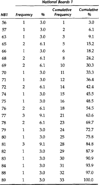
Second, the data can be displayed as a cumulative frequency distribution. Table 14-1 shows the cumulative frequency and cumulative percent for the National Board scores. These descriptive measures express the frequency of occurrence of scores up to and including any given value in the data set. For example, 25 students (75.8% of the group) scored 80 or below on this examination. Also, the score that defines the 97th percentile is 88.

Instead of displaying each individual value in a data set, the frequency distribution for a variable can group values of the variable into consecutive intervals. Then the number of observations belonging to an interval are counted.

A grouped frequency distribution for the National Board scores is illustrated in Table 14-2. Note that although the data are condensed in a useful fashion, some information is lost. The frequency of occurrence of an individual data point cannot be obtained from a grouped frequency distribution. For example, seven students scored between 74 and 77, but the number of students who scored 75 is not shown here.

Table 14-2 Grouped Frequency Distribution of National Board Scores

Scores Number of Students %
56-61 2 6
62-65 3 9
66-69 5 15
70-73 4 12
74-77 7 21
78-81 7 21
82-85 3 9
86-89 2 6

Graphs

Graphing represents another alternative in displaying data pictorially and allowing rapid assimilation of findings by the reader. A general rule for constructing graphs along the x and y axes is that the vertical y axis usually represents the frequency of scores occurring along the scale of measurement, whereas the x axis represents the scale that measures the variable of interest.

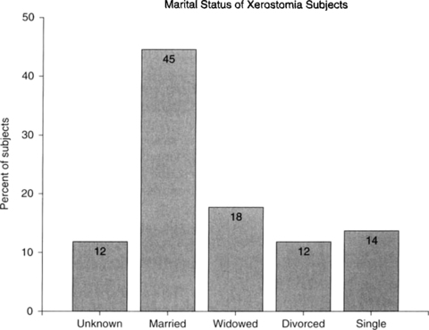
A bar graph is a two-dimensional pictorial display of data that is measured on a categorical scale, either nominal or ordinal. Each category is represented by a separate bar, and the height of the bar reflects the number or percent of observations belonging to that category. In a bar chart, the bars do not touch each other, and the order of the bars (categories) should be determined by what makes the most sense for the variable that is pictured in the chart. Figure 14-1 is an example of a graph of the distribution of a categorical variable measured on the nominal scale. Each bar displays the percent of the study’s subjects who belong to each category of marital status. Because the scale is nominal, the bars can be scrambled with no loss of meaning or understanding.

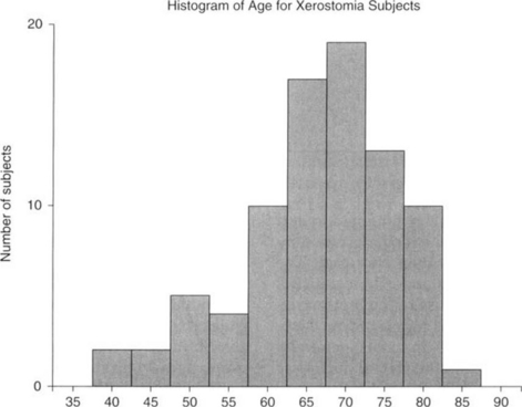
A histogram is also a graphic representation formed directly from a frequency distribution table, but a histogram is used to display a continuous measurement variable. A histogram is a display in which the horizontal (abscissa) axis is a continuous number line that represents the measurement scale of the variable of interest. These values on the x axis are grouped into equal intervals, and the number of observations in each interval are counted and displayed on the vertical (ordinate) axis. Graphically, a histogram is similar to a bar graph because the frequency is also represented by the height of a bar over the interval in question. However, the bars in a histogram must touch one another because of the continuous nature of the scale of measurement. Figure 14-2 shows the histogram for the continuous variable age (in years).

As required, the x axis is divided into equal intervals, namely 5-year intervals. The midpoint of each interval is displayed in the axis labels (40, 45, 50, etc.). The number of subjects belonging to each 5-year interval is displayed on the y axis. From this histogram, one can easily determine that these patients are seniors because the majority belongs to the age intervals older than 62.5 years.

Tables

In addition to graphs, data are often summarized in tables. When material is presented in tabular form, the table should be able to stand alone; that is, correctly presented material in tabular form should be understandable even if the written discussion of the data is not read. A major concern in the presentation of both figures and tables is readability (Box 14-1). Tables and figures must be clearly understood and clearly labeled so that the reader is aided by the information rather than confused. The student is directed to standard biostatistics texts for a formal discussion on summarizing data in graphic and tabular form. Also, scientific writing style manuals generally contain discussions on the formal display of tables and graphs. It is also helpful to scan the existing literature for good examples of both graphs and tables.

Stay updated, free dental videos. Join our Telegram channel

Jan 5, 2015 | Posted by in General Dentistry | Comments Off on 14: OVERVIEW OF BIOSTATISTICS

VIDEdental - Online dental courses

Get VIDEdental app for watching clinical videos